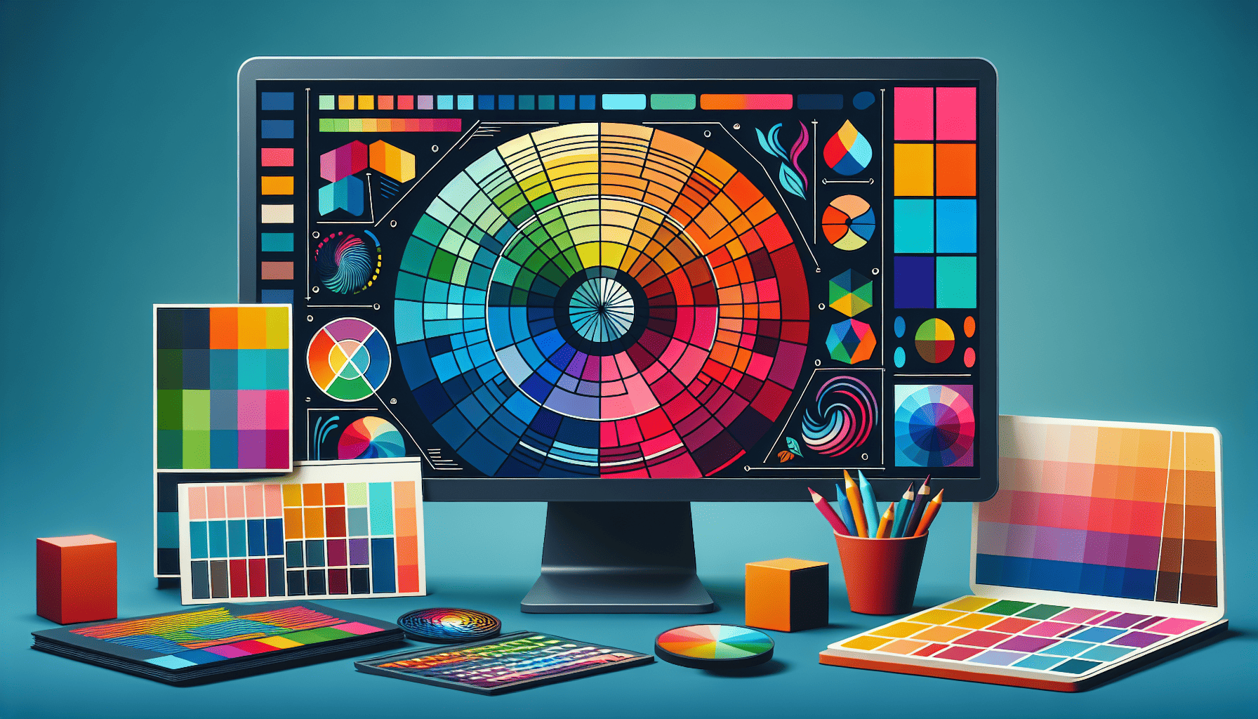
Color psychology plays a pivotal role in shaping user experience and behavior on websites. The strategic use of color can not only enhance the aesthetic appeal of a site but also influence visitors' emotions and actions, ultimately driving conversions and user engagement.
Understanding the Emotional Impact of Colors Each color has its own psychological effect, eliciting specific emotions and reactions. Recognizing these associations can help web designers craft visuals that align with the brand's message and the desired user response.
-
Red: Often linked with urgency and excitement, red can stimulate strong emotions such as passion and love. It's commonly used for call-to-action buttons to instill a sense of urgency. However, overuse can lead to feelings of agitation or anxiety, so it should be applied judiciously.
-
Blue: Known as a calming and trustworthy color, blue is frequently used by businesses to convey stability and reliability. It encourages a sense of tranquility and is popular in the finance and healthcare sectors. Despite its many positives, too much blue can appear cold or indifferent.
-
Green: Symbolizing peace, growth, and health, green is a versatile color that can be used in designs that promote relaxation or environmental awareness. It's also associated with wealth and is often used in products intended to promote health or financial prosperity.
-
Yellow: Representing cheerfulness and energy, yellow can capture attention and evoke warmth and optimism. It works well for brands looking to create a sunny, inviting atmosphere. However, excessively bright shades might strain the eyes and can sometimes appear overly aggressive.
-
Orange: Combining the energy of red and the happiness of yellow, orange is seen as an enthusiastic and energetic color. It's effective in promoting action, making it an excellent choice for e-commerce and retail websites aiming to foster impulse buying.
-
Purple: Associated with luxury, mystery, and creativity, purple is a favorite among brands promoting premium products. It conveys a sense of elegance and sophistication and is often used to attract a more creative audience.
-
Black: Representing elegance, formality, and power, black is often used for high-end products. It can convey sophistication and timelessness. However, excessive black can become overwhelming, so it's best used in conjunction with lighter colors.
-
White: Symbolizing purity, simplicity, and cleanliness, white is a staple in minimalist and modern design. It provides a neutral backdrop that accentuates other colors and is widely used for a polished and uncluttered look.
Creating a Cohesive Color Scheme Developing an effective color scheme involves more than just selecting individual colors; it's about creating a harmonious palette that enhances the message and usability of the website. Consider these tips for crafting a cohesive color plan:
-
Brand Alignment: Your website’s colors should align with your brand identity and values. Ensuring consistency across all platforms helps reinforce brand recognition.
-
Contrast and Accessibility: Choose color combinations that are user-friendly and accessible for individuals with visual impairments. Tools like color contrast checkers can assist in ensuring that text is readable and elements stand out appropriately.
-
Cultural Sensitivity: Be mindful of how colors are perceived across different cultures. Colors can have varied meanings, and understanding your audience's cultural context can prevent misunderstandings or negative associations.
-
Testing and Feedback: Execute A/B tests to observe how different color schemes affect user behavior. Collect user feedback to gauge emotional responses and make necessary adjustments.
In conclusion, leveraging the power of color psychology on your website can significantly enhance user experience and facilitate emotional connections. By carefully selecting and applying colors, designers can effectively communicate a brand's message, influence user behavior, and foster an engaging digital environment.
