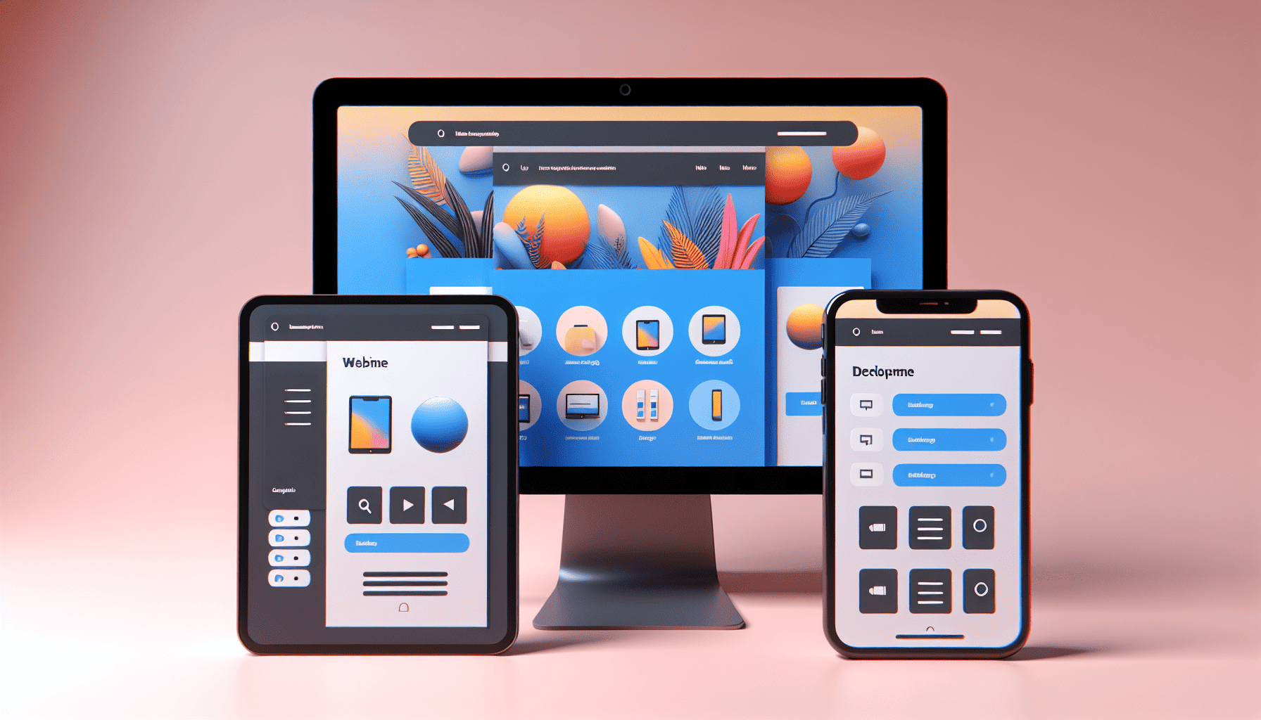
In today's digital world, where a myriad of devices with varying screen sizes and resolutions flood the market, having a website that adapts seamlessly across all platforms is no longer a luxury; it’s a necessity. Responsive design is the cornerstone of a user-friendly experience, ensuring that your website looks beautiful and functions optimally, whether viewed on a smartphone, tablet, laptop, or desktop. But what are the crucial aspects that make responsive design so effective?
At its core, responsive design is about fluidity. It revolves around the concept of creating flexible layouts, media, and images that can adjust effortlessly to the user’s environment. This approach not only enhances user experience but also improves search engine rankings, considering search engines like Google prioritize mobile-friendly sites in search results.
Key Components of Responsive Design
-
Fluid Grids: Unlike traditional fixed layouts, fluid grids use relative sizes - expressed as percentages - to design page elements. This flexibility allows the grid to resize in a dynamic fashion, ensuring the layout maintains its intended design across a multitude of screen sizes. This adaptability is essential for maintaining an aesthetically pleasing and functional site.
-
Flexible Images and Media: Images and media need to adjust to the size of the grids without losing quality. Techniques like CSS's max-width: 100% ensure that images scale appropriately without distortion. This ensures images don’t overflow their containers on smaller screens, maintaining the design’s integrity.
-
Media Queries: CSS media queries are instrumental in responsive design, allowing developers to apply different styles depending on the device characteristics like width, height, and orientation. By setting breakpoints with media queries, designers can create different layouts tailored to specific ranges of screen sizes, providing a more customized user experience.
-
Mobile First Approach: Designing for the smallest screen first and then expanding to larger screens ensures the core functionality of the website is available to all users. This approach helps prioritize essential elements, as constraints imposed by smaller screens push designers to focus on the most important aspects first, enhancing usability.
-
Viewport Meta Tag: Including the viewport meta tag in your HTML is crucial for regulating the width and scale of your content on different devices. This tag instructs the browser on how to display the content's dimensions and scaling, ensuring a consistent view across devices.
-
Touch-Friendly Elements: With an increasing number of users accessing sites via touch devices, ensuring that buttons and interactive elements are adequately sized and spaced is vital. This consideration avoids any frustrations from mis-taps and enhances the overall usability of the site.
Benefits of Responsive Design
Responsive design offers an array of benefits that extend beyond user satisfaction. It streamlines development and maintenance, as a single responsive site is easier to update than multiple device-specific versions. Furthermore, it enhances SEO because responsive sites typically load faster and experience reduced bounce rates, both of which are favorable to search engine algorithms.
Finally, responsive design future-proofs your website. As technology evolves and new devices enter the market, a well-crafted responsive design can adapt without significant overhauls, making it a sound investment both practically and economically.
In conclusion, the importance of responsive design in creating a seamless and engaging user experience on any device cannot be overstated. By focusing on flexible layouts, images, and adaptive design practices like media queries, developers can ensure a website that not only looks stunning no matter where it's viewed but also performs optimally, maximizing engagement and accessibility in our multi-device world.